I recently subscribed to a bunch of blogs that deal with UX trends and best practices. One of those blogs is one on the Mockplus product site, which is a prototyping tool for web apps.
Normally I access my subscriptions on my phone, through the Feedly app. 90% of the those times, I don’t hit the actual post URL in a browsers since most blogs set their RSS broadcasters to deliver all of the post content. Mockplus only broadcasts a summary, so I have to load up the URL.
Here was the first post from the Mockplus blog I saw in Chrome for Android. Note the paradox when you compare the experience to the post title.
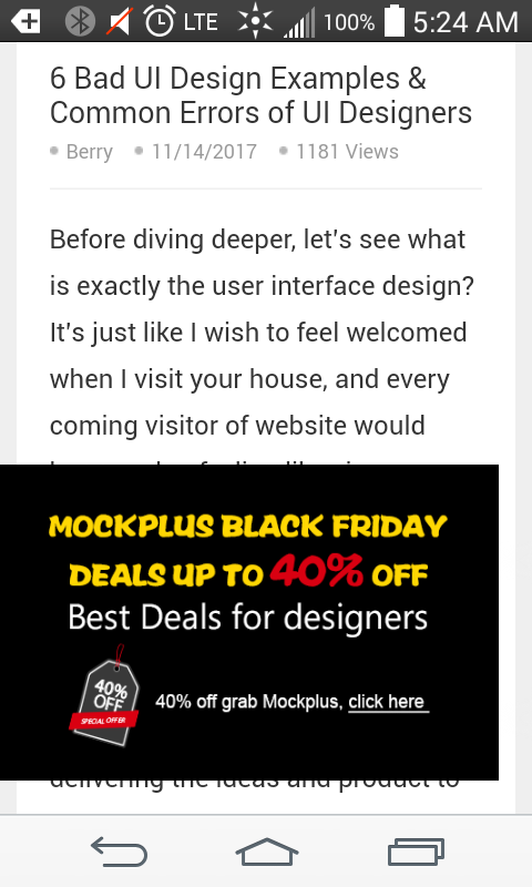
Also note there is no way to close the imposing ad, so you have to scroll through the entire post while the ad persists. I squinted so hard trying to read the post that my eyebrows popped off.
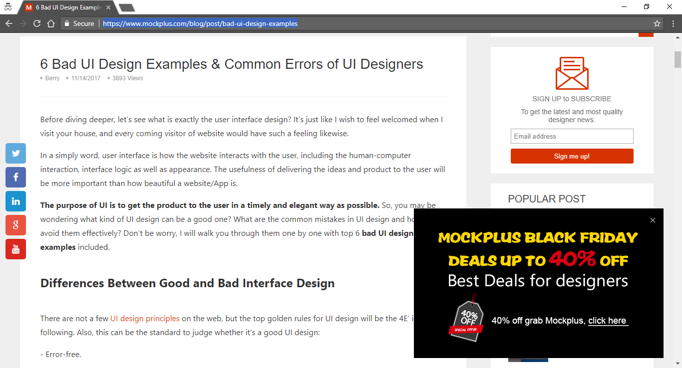
Here’s my experience on the desktop version of Chrome. The interstitial ad is still there, and though it covers a bit of the content, there’s a way to close it.
I’m in the UX camp of “no interstitial flow” unless the user prompts it, and less than 30 seconds would normally be spent inside it. No surprise ads while the user is reading; that would never happen if I had full decision-making—especially no full-page ads. I’m waiting for the news story about one of those causing a heart attack.
I’d also like to make it clear to the user that they’d be launching an interstitial, but I don’t think there’s good iconography language around that. The language that does exist for meta-navigation is currently being taken up by communicating external links, uploading and downloading, etc. That sort of thing would have to come from a big UX influencer if it were to catch on at all.