The past few months saw the software engineer side of me agonize over weather.com’s mortally offensive UX. Ads everywhere, demonic load times, and the weather you’re looking for is somewhere. Please, stop.
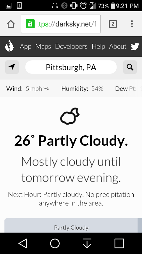
Farting around Google lead me to forecast.io, which recently became darksky.net. Loads quick, info that 80-90% of people are looking for is right at the top, no overstimulating visual garbage. And they never bug you to download their app. My only minor qualm is the weather map, just below the current conditions. Unless you’re using a browser’s scrollbar, when you scroll down the page you will automatically start sliding the map instead of continuing down the page. Most people don’t want to slide around the map that much, or at all. I would keep the map visible but overlay a subtle gray along with a message to indicate that it’s disabled. The user would have to tap it to enable sliding.
Enjoy my mobile screenshot:

5 Comments
This won’t give you the local forecast, as such, but it’s a whole lot of fun. Click on “Earth” to play around, and the compass symbol in “control” to get your local conditions:
https://earth.nullschool.net/#current/wind/isobaric/850hPa/orthographic=-76.60,45.73,481
I usually access the site from work or from my mobile…both places where it can read my location. If access with locationing (?) turned off, you’d probably get the weather for NYC or whatever their default is.
Btw, my son loved that 3d earth thing. He’s going through a huge map phase right now.
Once he learns the ins and outs of it, he can learn to make your forecast for you.
As to location, there is no default, but I can see how it wouldn’t view well from a mobile.
My fault…I was talking about darksky.net, not your link. But we will exlpore the earth link tonight, since it’s a lot easier on desktop than mobile 🙂 He’ll be in heaven with all the different versions you can see on there. Some of it fascinates me, too. I don’t know what it is…maps, city skylines, cloud photography. Different aspects of creation, I guess.