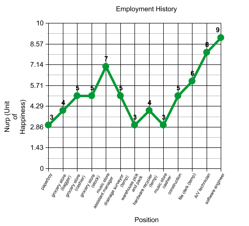
This was a neat exercise, mapping my employment history and assigning levels of happiness to them. I used the word “nurp” as a unit of happiness, a play off of Alvin Plantinga’s “turp” as a theoretical unit of evil.
THe ratings I gave each position were based on pay (duh), the actual work itself and the environment, and how it compared to my basic position in life—so it’s very contextual. An 8 position 20 years ago could be a 2 position now.
I used this kid-friendly graph creator.
2 Comments
That’s pretty neat. I like graphs. If I were to make a graph like this, pretending for a moment that I had been working all these years, I would leave pay off the metric because it could bloat the score on a job you loathed or where there was a generally bad environment. I could make a graph on the peaks and valleys of being a housewife, but it would mostly likely appear flat.
I like graphs, too, especially when they empiricize something theoretical like this because it’s so theoretical. And really personal in this case.
I did balance the pay thing with the “job enjoyment” factor. Like the music store assistant manager…pay was mediocre but it’s a job I really gunned for. Warehouse pick and pack was good money but the work environment was the worst I’ve ever been in.