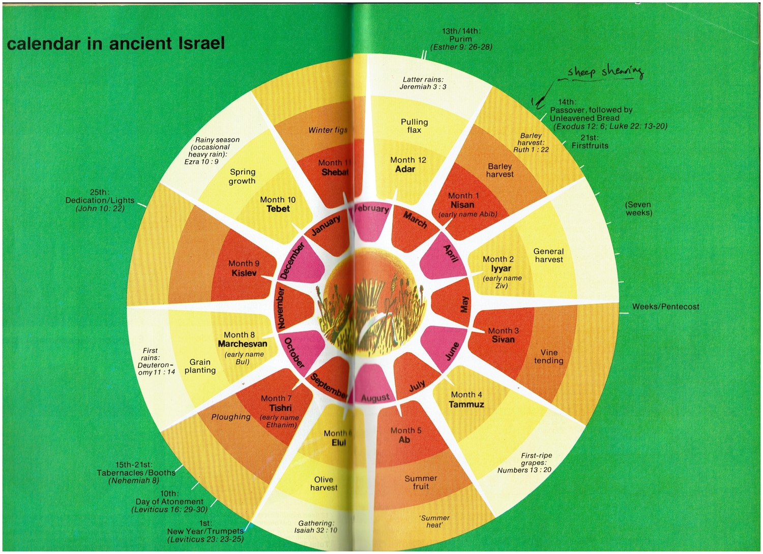
Ed scanned a calendar he had on his wall: an ancient Hebrew calendar with the modern Gregorian calendar within it, for comparison’s sake. Interesting design, and for sure there are other ones like it if you search, and it lends itself easily to making it dynamic.
It could be a website…as in, only a website—please, heavens no, no one needs any more apps on their phones—with a two-layer sunburst graph, visualizing the two calendars. The graph itself would only need to be dynamic in the sense that every day or a few days, a marker would shift position to the appropriate place on the graph. There could also be an area for any useful practical or historical information on the day, and possibly some rollovers on the graph itself that would call out important days.
Here’s a quick sketch of the idea, done at mockflow.com:
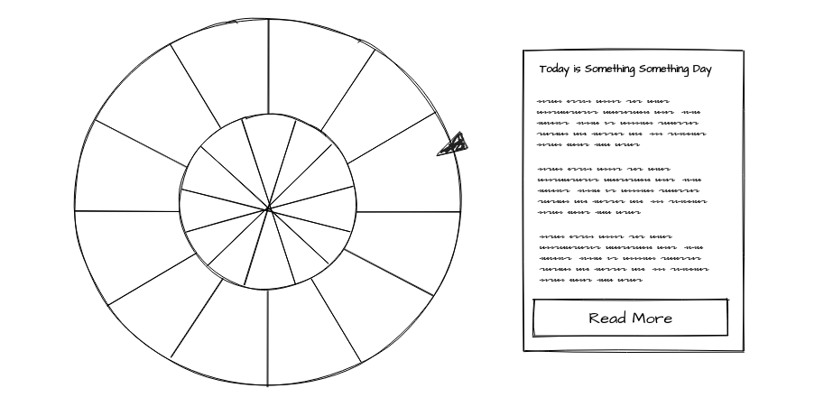
This could easily be done using Chart.js or D3. I’m too old to be a scrappy young programmer looking to fill out his portfolio, but any of those reading this could take this on.
4 Comments
Footnote: Eerdman’s Handbook of the Bible, 1973, Lion Publishing.
Thanks Ed. Is that a book you recommend?
Yes, for the charts if nothing else. You won’t find that kind of graphic reference material anywhere else that I know of. That book has lots of stuff like that.
Thanks.
He has a Dictionary of the Bible, which looks good, but I don’t know why in the world the Kindle version is way more than the print versions…at $54.99!
https://www.amazon.com/dp/B089ZZXDZT/