I had a much longer post about Amano’s paintings, that involved things with H.R. Giger (they aren’t connected at all, but I made them connected), but I didn’t like how it turned out. It mostly doesn’t matter, anyhow.
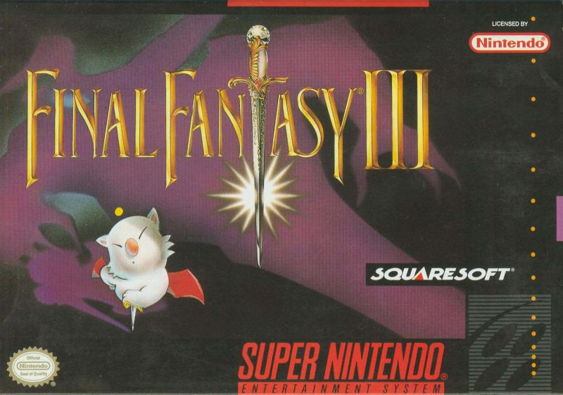
I would like to post the famous piece Amano made that ended up on some versions of the Final Fantasy VI box art…namely, the Japanese version. Of course, the American version is far less interesting, and for some reason features one of the minorest of minor playable characters in the game: Mog. Any self-effacing teenage dude (me) would have to wait until the instruction manual to get this gem, where you have the colorful protagonist in a spiky, obsidian rideback mech, overlooking a jumbled landscape of sleek spires, ponderous paisley domes, and alternate-reality steampunk hot air balloons. Which one speaks “high-fantasy” to you? A half-koala bear with bat wings, or this?:
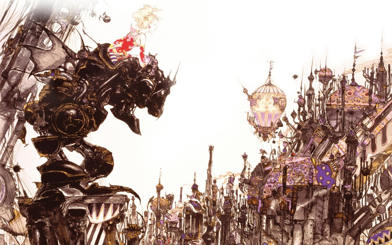
Back then, box art was always different, and usually better, than the graphics in the games themselves. I had always thought Amano’s art style would be the basis for a great design language for a otherworldly video game, but everything now has to be super colorful, intensely-graphicked, with real-world physics all the time, or we lose interest. There’s a few games that come close to a fine art aesthetic, most notably GRIS, but also a little bit of Candle and some Dordogne. They are indie platformers or some genre other than JRPGs, and platformers are known for their women with the Big Sad Childhood than their stories. That’s what you get when you let millennials write video game backstories and settings.