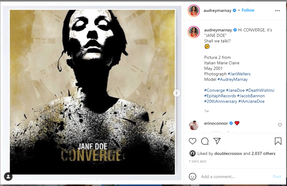
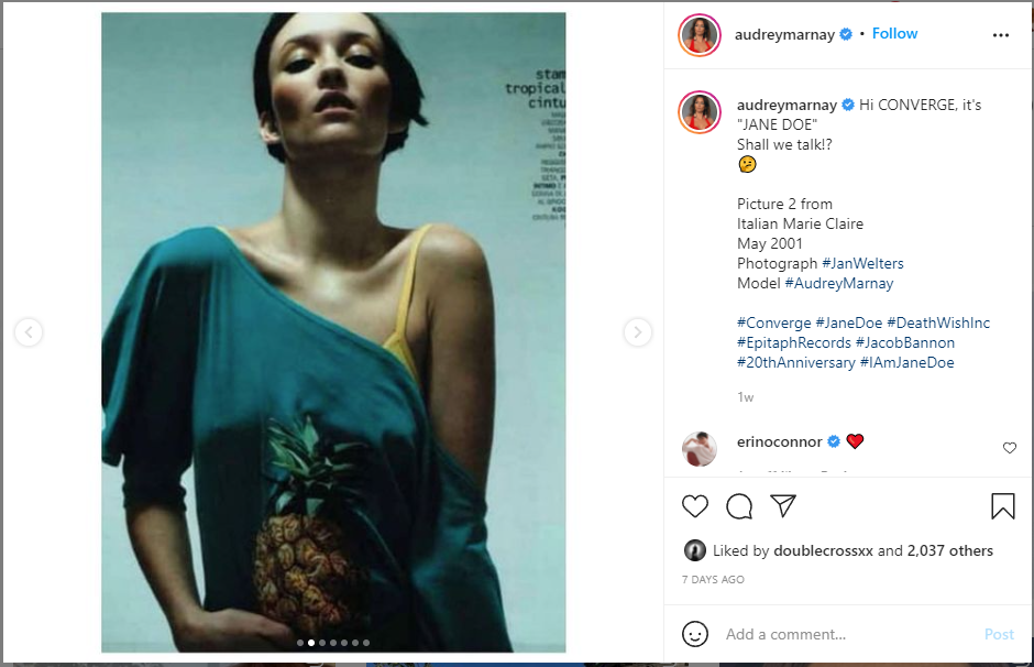
It turns out the woman’s iconic face from Converge’s Jane Doe album cover art is a real woman’s face, and that woman found out 20-ish years after the fact and posted on Instagram about it.
Converge’s vocalist, Jacob Bannon, who also did the artwork, responded:
“Just to be clear: This is definitely one of the sources for the original stencil/mixed media piece for the Jane Doe album. Most of my work always been collaged cut/paste based (and still is). Hundreds of images were xeroxed and repainted/inked in a loose style to create the release artwork. This process is similar to everyone from Shepard Fairey to Francis Bacon. Over time my work has evolved into something more much more refined, but the roots will always be in this style. I wonder if folks will still insist that it is actually from the cover of Slayer‘s Reign in Blood?
The original goal was to create ghost-like forms that embodied the concept of Jane Doe. In recreation identifiers are removed from physical forms, making all humans become relatable and stoic. We see what we want to see in them, and often times, it’s a reflection back onto our own life experiences, etc.”
This is where the gray area of artistic expression (heh) is made obvious. It’s clearly an altered version of the photograph, but did Bannon alter it enough to make it his own work? The context is completely different; the intended use for Bannon’s art isn’t explicitly commercial in the sense it was used in an advertisement, but the image has been on plenty of the band’s merchandise.
Likely, this wouldn’t have gotten so much attention if the album wasn’t so huge in metal circles (even Google considers it a top metalcore album of all time), and if Bannon wasn’t an established, high(ish)-profile artist to begin with. This may have been avoided if Bannon gave credit in the liner notes, but that would could open up a whole box of legal and financial implications.
Interesting to note that Jane Doe‘s lyrical themes are about lost love, and the figure of Jane Doe on the cover and the figures inside the booklet are meant to be anonymous stand-ins for love interests: “ghosts” of relationships past, identifiable as different women, but with no more distinguishable features. There’s probably some feminist crowing to be done about the idea that a real person was dehumanized, if you’re inclined to do such a thing, but that’s the whole point. Being disillusioned from a damaged relationship might cause you one to “dehumanize” the formerly beloved as a coping mechanism. Or, if you want to be more generous, creating metaphorical distance between yourself and the object (whoops) of disillusionment by anonymizing her also protects her from harm from that disillusionment.
Or whichever. I like the art.
3 Comments
I can’t count how many times I found the perfect picture for a book cover but couldn’t get permission to use it. Silent borrowing works only if no one notices. Great image for merch but risky business.
I keep forgetting my tablet does crazy things without telling me.
No worries. I deleted the dupe comment.
The band had already been internationally known at that point, though only in specific circles. In 2001 (when the album was released), I don’t think there were any social media sites to begin with, so it’s not like that was a factor.