Read part 1: How to Create Good Video Game Subtitle UX.
Poking through YouTube’s game playthroughs, as well as related things coming up at work, got me riled up to write a follow-up post on subtitle UX. I was watching a short Red Dead Redemption 2 interaction, when I noticed that the subtitles illustrated the easiest solvable problem in subtitle legibility—color contrast—by using a dark background beneath the white text. A stylized background, too. I don’t have the game, so I’m not sure if that’s the default subtitling UI. Good on the game developers if that’s the case.
There was a drawback, though, in that there wasn’t any attribution to the dialogue. Granted, the only dialogue in that linked video was between the player character and the widow, and your character likely didn’t know her name. Although I think there still should’ve been attribution—”Angry Woman” is good, or even just “Woman”—one interaction isn’t enough of a representative sample.
I checked out some other playthrough videos of the same game, and some had attributions, like this one, but not all the time. That attribution text, too, was gray on a black background. Not quite as readable as it could be.
Then I looked at some playthrough of the some other games, like (deep breath): Shadow of the Tomb Raider, Horizon: Zero Dawn, Call of the Sea, Final Fantasy XV, Bayonetta 3, Assassin’s Creed Valhalla, NieR: Automata, and Knack 2. All with mixed results, but I did notice that different playthroughs of the same game had different subtitle styling. I checked my install of the Master Chief Collection, to see if it had options to change the subtitling beyond “on” or “off.” It did, so I did some adjusting. Here were my final settings: 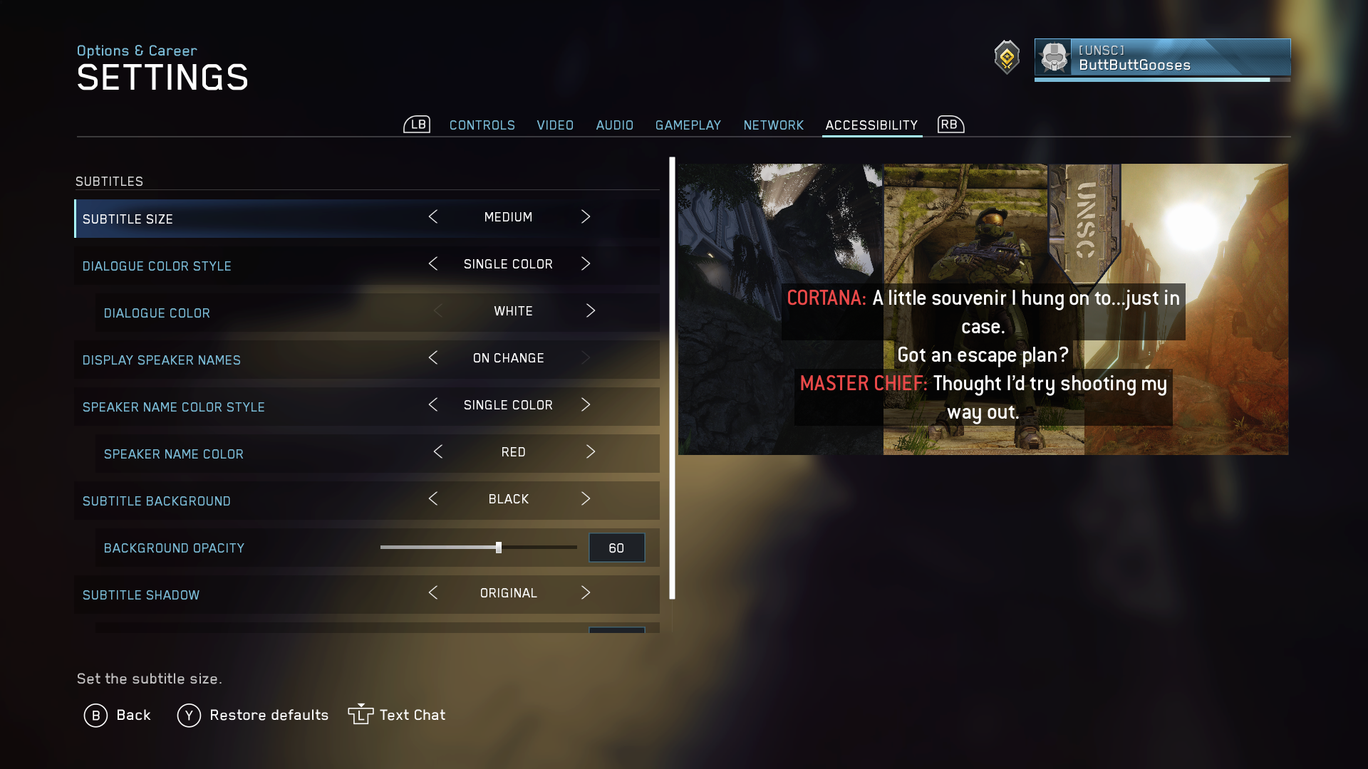
Now to smoke test the settings. I made a compilation of scenes from Halo: Reach and Halo 4, both cinematic and during gameplay, to see how the subtitles felt. There’s a different dynamic when you’re consuming subtitles during those two times, so it makes sense to see how they work in both environments. All the scenes are original Jay creations, straight from my Xbox:
The red dialogue attributions were sometimes dodgy, as you can see around the :35 mark, where the dawn sky behind it lowers the contrast. Setting the dialogue background at 100% opacity would’ve solved the issue. I prefer the Halo 4 subtitles a little more because of the font size, and for some reason I didn’t set the attribution (“DISPLAY SPEAKER NAMES” on the settings screen) to “always,” which would be better for accessibility.
I searched YouTube even more to find other games that had perfect or near-perfect subtitles, not only for accessibility but also in terms of general user experience. Ideally, those are interchangeable factors, but in practice they sometimes aren’t.
Here’s compilation video of scenes from the games Final Fantasy 7 (Remake), Toukiden: The Age of Demons, and Fire Emblem Warriors: Three Hopes. I didn’t create any of the videos but I link to the uploaders at the end of this post.
Final Fantasy 7 – 0:00 to 7:08
Great attribution consistency and placement: the speaker’s name is always in the same place, and separated by the horizontal rule, and the text is left-aligned (yes!) if it wraps to a second line. I don’t know the obsession designers have with centering long strands of text when it’s so awful to read. Yes, I centered the title text in the beginning of these videos but Windows’ Video Editor program doesn’t have that option.
One of the great bonus ideas they did was to display ambient dialogue subtitles. When Cloud is walking through the Midgar Slums or the train, crowd dialogue subtitles are running on the left side, not as in focus as any main conversation dialogue in the bottom center. Great world immersion technique that I don’t think I’ve seen in another game.
Toukiden: The Age of Demons – 7:08 to 9:11
Great field play subtitling, with a strong font-background contrast and in the lower left corner so it doesn’t bump into the control display in the lower right. Attribution is only the character’s face, which I think is okay, but including the name with it would be perfect.
For this and the Fire Emblem game, they have approaches to the cinematic scenes different than Halo’s. They are more “field cinematics,” if that’s a real term, where they show the characters not so much in a cutscene but in the playable area, much like how they were on RPGs for earlier-generation consoles. There’s more freedom to ramp up the subtitling UX because the focus isn’t 100% on the cinematic visuals. The subtitling you see at the 8:18 is picture perfect. Attributions always on, sufficient contrast—though maybe the attributions have a small issue—headshots of the characters, placement of the headshots, even their expressions change to fit the context. Even with dialogue from many different characters in the same scene, it’s easy to keep track of everything.
Fire Emblem Warriors: Three Hopes – 9:13 to end
The same comments for Toukiden apply here, except with the field play the character names are included in the attribution. Nice! Except for checking the contrast and background, I can’t find any fault with these subtitles. I’d like to see how Toukiden and Fire Emblem handle the ambient dialogue situation but there doesn’t seem to be any.
Taking my recommendations from the first post on subtitling UX and modifying it a bit, subtitling should, by default:
- Have good color contrast, font size, and line length
The subtitles should be easily found and read, but not front-and-center. It shouldn’t distract too much from effective gameplay, or from getting in the way of cinematic scenes and steal the spotlight from the drama. Dialogue text should be left aligned inside its container. - Be in sync with the audio
Short bursts of subtitles help reduce long reads and can help from spoiling the drama, where information can sometimes be read before it is heard. - Be displayed in where the user expected
For standard subtitles, the text should appear consistently, given the context. Cinematic subtitle placement could be place differently than gameplay subtitles. A comic book-style game with dialogue bubbles, will have inconsistent placement but will be where the user expects them to be. - Be distinguishable from in-game UX
Characters don’t see subtitles, just like we don’t see words hovering in the air in real life. However, depending on the technology or magic system in the game’s universe, there could be exceptions. - Have sufficient attribution, set apart from dialogue text
Important in third-person cinematic scenes, especially if there are characters with helmets that obscure mouth movements, or non-human characters with unorthodox mouths, or characters using telepathic communication, etc. - Enjoy reduced widows and orphans
Orphans aren’t so common, but widows are: those pesky one or two words that wrap to another line of text at the bottom, when there’s a full line of words right above them. Asymmetrical line lengths can increase cognitive load. - Be styled to express context and character
Italics, all caps, perhaps a different font color or font face, can help with emphasizing emotion and world-building. If character faces are used in attribution, they should change expression to provide context. “I’m gonna punch your lights out!” holds very different meanings whether said with an angry face or a surprised or happy face. - Be customizable
Users should be able to turn them on or off, adjust font appearance and background, etc.
Final Fantasy 7 footage by @Krystal109
Toukiden: The Age of Demons footage by @AyaAnnyGaming
Fire Emblem Warriors: Three Hopes footage by @MaskedMetaKnight4
2 Comments
Lacking any real knowledge, I always assumed the bad subtitles were a function of developers trying to be artsy instead of actually serving the customer.
Artsy might have something to do with it, but mostly it was to CYA to make sure the company doesn’t get sued for not being accessible. I’m thinking it was standard practice to just copy how closed captioning does it for television, which isn’t the greatest to begin with. I think it’s slowly getting better because ADA has been litigation-happy in the last decade or so, with online and digital content.
In my view, the dev team should have a UX writer, or a writer and a designer paired up, dedicated to handling the subtitling, but I’m not too familiar with the details on how games are developed.