While watching RazörFist’s stream of the new Halo Infinite game, I realized how not-great the subtitle UX (user experience) was. It ranged from serviceable but awkward, to slightly confusing, to unreadable.
Good video game dialogue and subtitle UX should (in rough descending order of severity):
- Have good color contrast, size, and line length
The subtitles should be easily found and read, but not front-and-center. It shouldn’t distract too much from effective gameplay, or from getting in the way of cinematic scenes and steal the spotlight from the drama. - Be distinguishable from in-game UX
Characters don’t see subtitles, just like we don’t see them hovering in the air in real life. However, depending on the technology or magic system in the game’s universe, there could be exceptions. - Have sufficient attribution, set apart from actual dialogue
Important in third-person cinematic scenes, especially if there are characters with helmets that obscure mouth movements, or non-human characters with unorthodox mouths, or characters using telepathic communication, etc. - Enjoy reduced widows and orphans
Orphans aren’t so common, but widows are: those pesky one or two words that wrap to another line of text at the bottom, when there’s a full line of words right above them. Asymmetrical line lengths can increase cognitive load. - Use Gestalt proximity where possible
Subtitles placed near the speaker can help the user easily attribute the dialogue more quickly. - Be styled to express context and character
Italics, all caps, perhaps a different font color or font face, can help with emphasizing emotion and world-building.
I took some screenshots of the stream and point out where the subtitling UX is good and where it could be improved. The subtitle UI (user interface) bleeds a little bit into the chat stream on the right hand side, which isn’t part of the game itself. Below those screenshots are a few attempts at creating a pattern to solve for the readability issues.
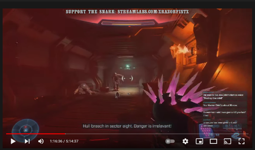
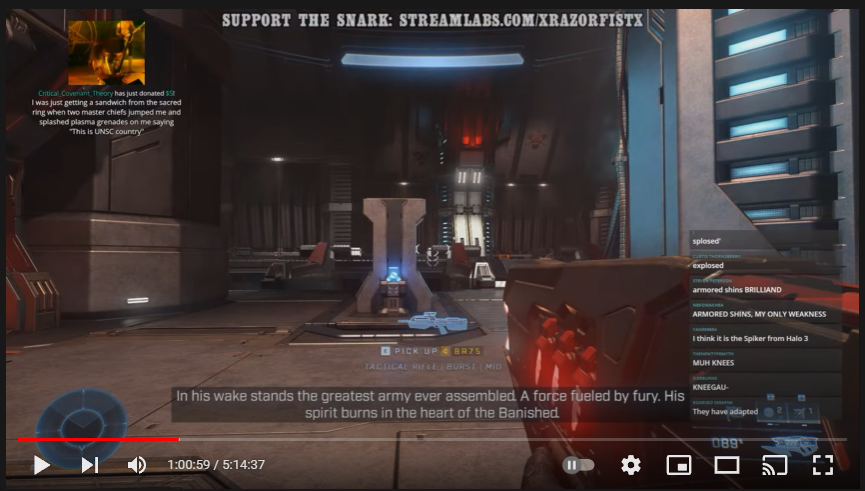
Text is readable here, but there’s no attribution. Who is saying this? You would need the audio for that. Some subtitled dialogue in the game has attribution (you’ll see those down further), others don’t. The inconsistency is annoying:
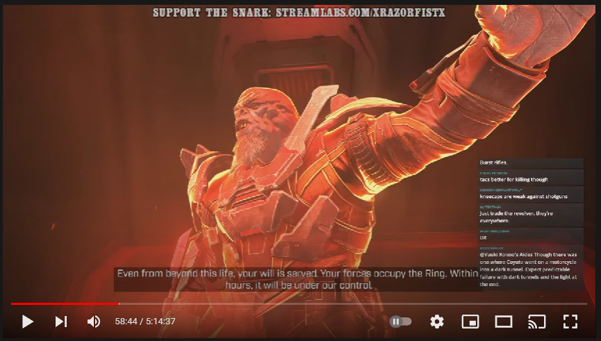
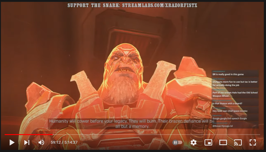
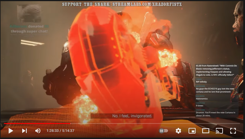
These feels okay, though they could even up the line lengths a little. There’s starting to be not a lot of color contrast between the text and the hologram image of the Brute. Attribution isn’t so important here since this is pretty much a monologue, but there’ve been instances in Halo games I’ve played where characters talk over hologram speeches, and where characters talk over others in general, so attribution would still be warranted:
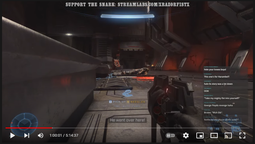
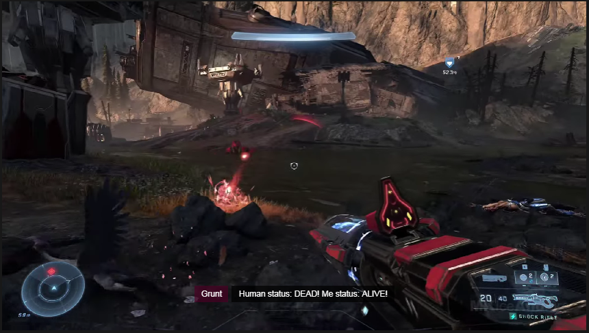
No attribution in the next few screenshots. One thing to keep in mind is if the character you’re playing (Master Chief, in this case) doesn’t know the name of whoever is talking, he probably knows the kind of being talking. Here, I think it’s one of the Grunts/Unggoys, so attribution can still occur with using just that:
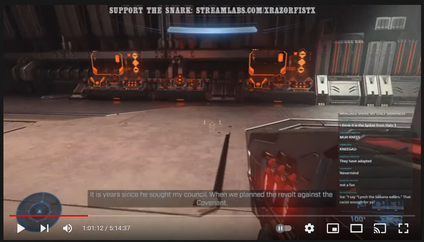
That one widowed word, “Covenant,” is obvious and a but annoying:
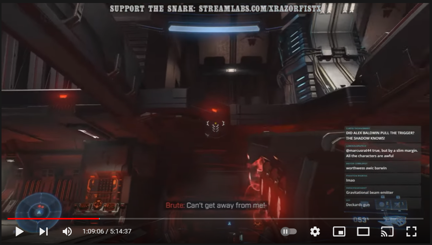
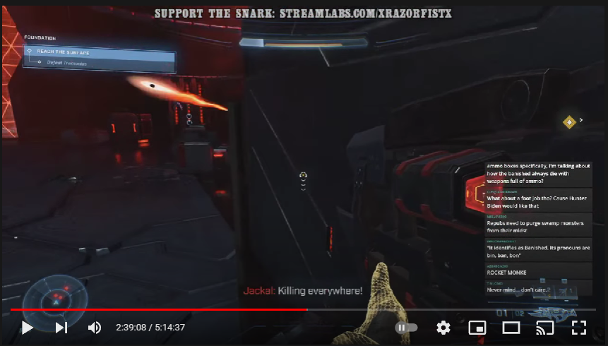
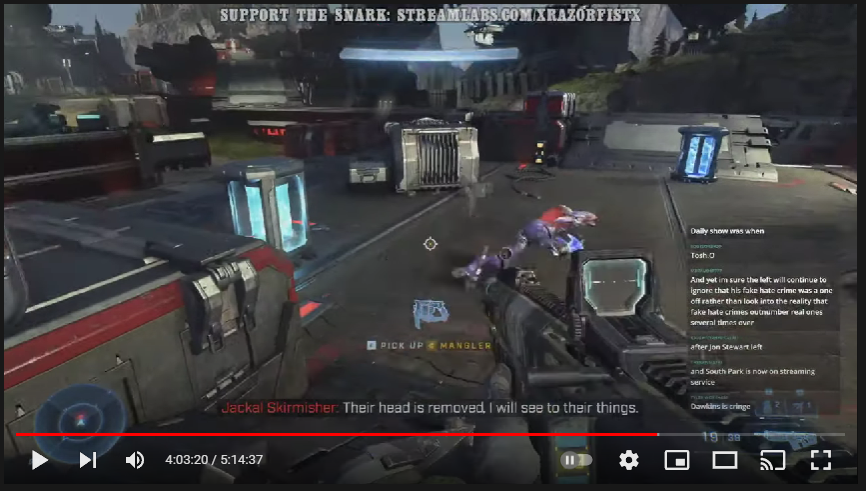
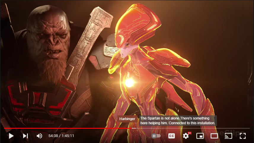
Attribution! It’s not a proper noun; Master Chief wouldn’t know the names of random enemy soldiers, but it’s attributed as “Brute” because he would know what kind of creature is talking. The different alien races in Halo have distinct vocal characteristics that make the easy distinction possible:
Same with these next two here:
Attribution, but it’s unreadable:
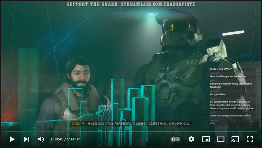
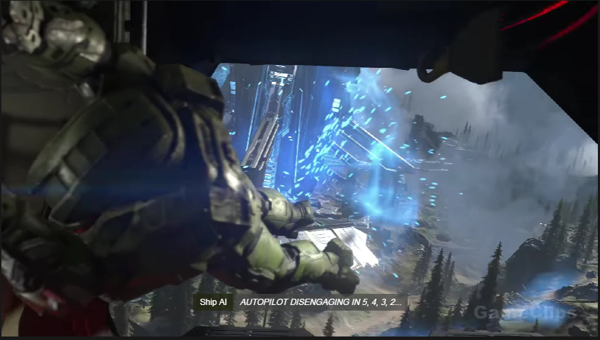
This is good. Color-coded attribution, and the subtitle is stylized in all caps to symbolize the AI’s speech:
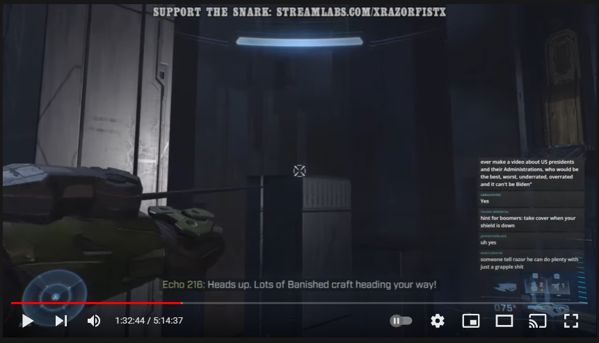
Same here. “Echo 216” is the pilot’s callsign:
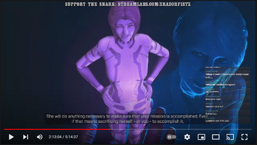
There’s two “she’s” visible here. We don’t exactly know who is speaking about whom. Some minor color contrast problem:
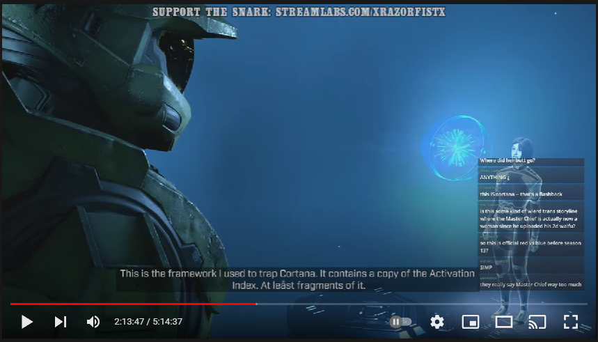
No attribution:
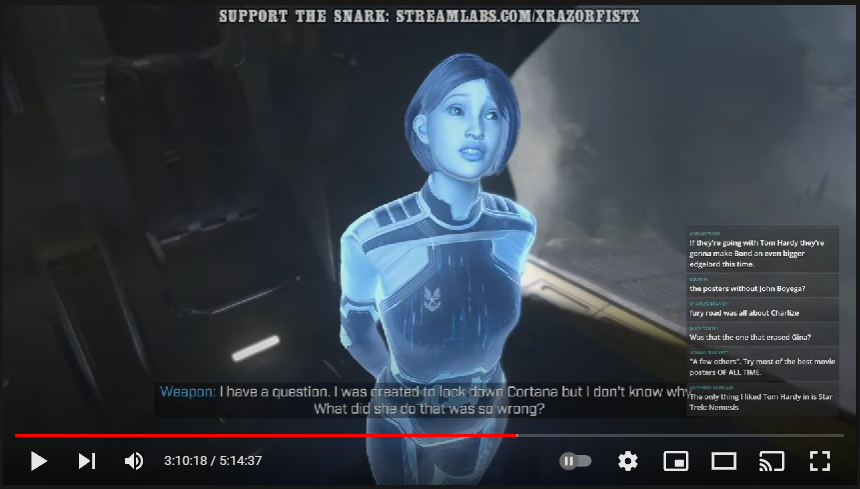
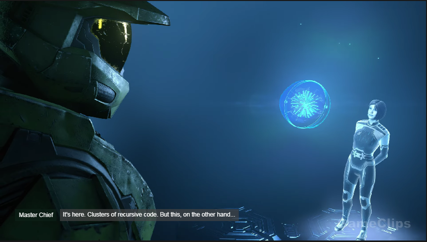
Some minor color contrast funniness. There’s attribution, and it’s color-coded to match the primary color of her holographic body. Attribution is almost necessary here, because she doesn’t look like she’d be named “Weapon,” and (I think) this is the scene where she’s introduced:
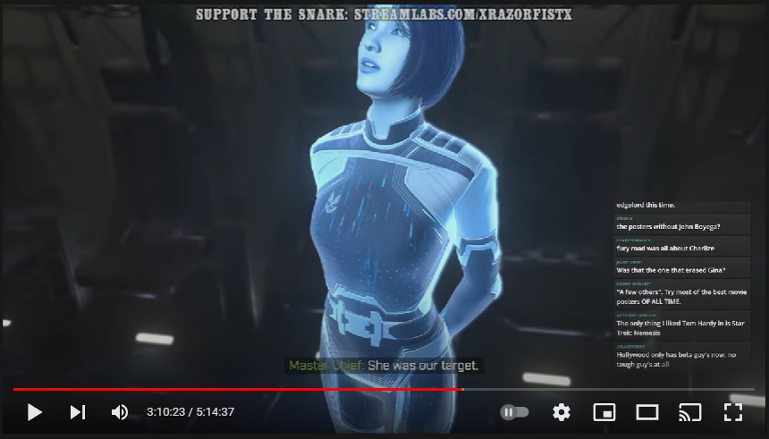
More color-coded attribution; good, though there’s some contrast issues.
I actually couldn’t find really good subtitle UX in any FPS (first-person shooter) game like Halo Infinite, either during cinematic scenes or during the gameplay, where its effectiveness is really tested. There might be something out there, but I don’t play games too much anymore, so I wouldn’t be familiar with which ones they would be.
Here are the attempts I did to improve upon the pattern. These screens were taken from this GameClips video of all the game’s cutscenes. The biggest changes were setting apart the dialog attribution into a separate box with a different colored background, evening out the line lengths if it needed to wrap to another line, and in the case where there were more than one character on screen, moving the subtitling nearer to that character. Though it wasn’t necessary, but the one screenshot with the AI speaking I made italic. Off-screen dialogue has been traditionally stylized in italics.

2 Comments
I watched bits and pieces of this on YouTube. I quite agree they did it wrong way too often. I rather like your examples of doing it better.
Maybe someday game devs will get on the bandwagon.
1 Trackback or Pingback